Bokeh 小册子: figure 详细解读
阅读量:次 Authors: 阳哥 PYTHONVISUALIZATION
Bokeh
阅读量:次 Authors: 阳哥 PYTHONVISUALIZATION
Bokeh
Table of Contents
figure 在 bokeh 绘图中有着重要的作用,今天我们来开始了解 figure 的用法, 希望对大家有所帮助。
本次运行环境为:
Bokeh 中绘图的一般步骤
本文主要来介绍 figure() 的基本用法。
首先,加载bokeh库
from bokeh.plotting import figure, output_notebook, show

output_notebook()
plot_width, plot_weight 可以设置绘图区的宽度和高度。
设置参数值,如下:
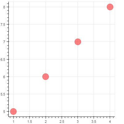
p = figure(plot_width=400, plot_height = 400)

p.circle([1,2,3,4],[5,6,7,8],size=20, color='red', alpha=0.5)

show(p)
图示如下:
width, weight
width, weight 也可以设置绘图区的宽度和高度。
查看官方文档,用的是 plot_width 和 plot_weight 两个参数,但实际上 width 和 height 也有同样的效果,大家不妨探索下。
代码如下:
p = figure(width=400, height = 400)

p.circle([1,2,3,4],[5,6,7,8],size=20, color='red', alpha=0.5)

show(p)
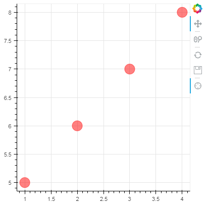
工具可以是以下 value,可以根据实际情况来选择合作的工具使用。
“crosshair,pan,wheel_zoom,box_zoom,reset,box_select,lasso_select,save,help”
# 工具可以是以下 value,可以根据实际情况来选择合作的工具使用
# tools = "crosshair,pan,wheel_zoom,box_zoom,reset,box_select,lasso_select,save,help"
tools = "crosshair,pan,wheel_zoom,reset,save"


p = figure(width=400, height = 400, tools=tools)

p.circle([1,2,3,4],[5,6,7,8],size=20, color='red', alpha=0.5)

show(p)
图示如下:
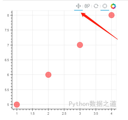
toolbar_location, 设置工具栏显示的位置,参数值可以是: “below, above, left, right”,默认值应该是 “auto”
tools = "crosshair,pan,wheel_zoom,reset"


p = figure(width=400, height = 400, tools=tools, toolbar_location='above')

p.circle([1,2,3,4],[5,6,7,8],size=20, color='red', alpha=0.5)

show(p)
图示如下:
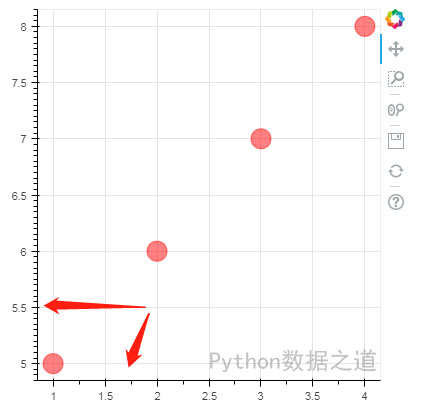
x_minor_ticks, y_minor_ticks 默认值是 “auto”,其他值可以是大于1的整数
示例如下:
p = figure(width=400, height = 400,
          x_minor_ticks=2, y_minor_ticks=10)

p.circle([1,2,3,4],[5,6,7,8],size=20, color='red', alpha=0.5)

show(p)
图示如下:
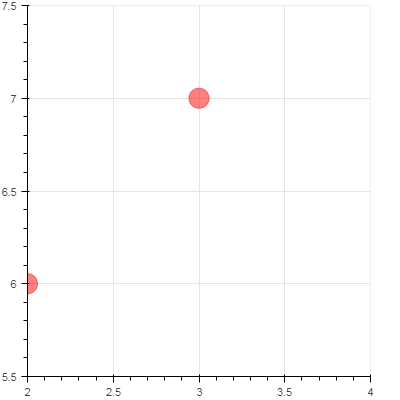
x_range, y_range 可以是 list 或 tuple 表示范围的形式数值
示例如下:
p = figure(width=400, height = 400, x_range=[2,4], y_range=[5.5, 7.5])

p.circle([1,2,3,4],[5,6,7,8],size=20, color='red', alpha=0.5)

show(p)
或者
p = figure(width=400, height = 400, x_range=(2,4), y_range=(5.5, 7.5))

p.circle([1,2,3,4],[5,6,7,8],size=20, color='red', alpha=0.5)

show(p)
图示如下:
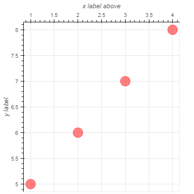
x_axis_label, 设置 x 轴 的名称
x_axis_location, 设置 x 轴 的位置,有两个值,在上面显示(”above”) 和在下面显示(”below”),默认值是 “below”
p = figure(width=400, height = 400,
           x_axis_label='x label above', x_axis_location='above',
           y_axis_label='y label')

# x_axis_location, default value: "below", values are [ above, below]

p.circle([1,2,3,4],[5,6,7,8],size=20, color='red', alpha=0.5)

show(p)
图示如下:
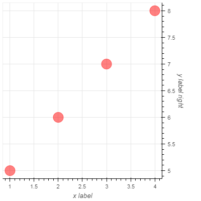
y_axis_label, 设置 y 轴 的名称
y_axis_location, 设置 y 轴 的位置,有两个值,在左边显示(”left”) 和在右边显示(”right”),默认值是 “left”
p = figure(width=400, height = 400,
           x_axis_label='x label', x_axis_location='below',
           y_axis_label='y label right', y_axis_location='right')

# x_axis_location, default value: "below", values are [ above, below]
# y_axis_location, default value: "left", values are [ left, right]

p.circle([1,2,3,4],[5,6,7,8],size=20, color='red', alpha=0.5)

show(p)
图示如下:
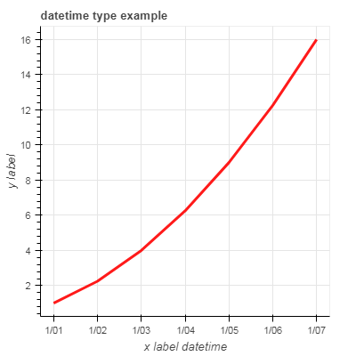
(1)x_aixs_type: “datetime”
若是时间数据,可以将 x 轴或者 y 轴的数值设置为 日期形式
import pandas as pd

rng = pd.date_range('2018-1-1', periods=7)

rng
out:
DatetimeIndex(['2018-01-01', '2018-01-02', '2018-01-03', '2018-01-04',
               '2018-01-05', '2018-01-06', '2018-01-07'],
              dtype='datetime64[ns]', freq='D')
x = [1.0, 1.5, 2.0, 2.5, 3.0, 3.5, 4.0]
# y = [10**(i**2) for i in x]
y = [i**2 for i in x]

p = figure(width=400, height = 400, title='datetime type example',
           x_axis_label='x label datetime', x_axis_location='below',
           y_axis_label='y label', y_axis_location='left',
           y_axis_type='linear', x_axis_type='datetime')
# y_axis_type, "auto" 和 "linear" 的效果是一样的

p.line(rng,y,color='red',line_width=3, alpha=0.9)

show(p)
图示如下:
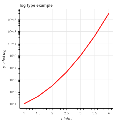
(2)y_aixs_type: “log”
有时候,我们需要将 x 或 y 轴的数据设置成 对数(log)形式,如下:
x = [1.0, 1.5, 2.0, 2.5, 3.0, 3.5, 4.0]
y = [10**(i**2) for i in x]

p = figure(width=400, height = 400, title='log type example',
           x_axis_label='x label', x_axis_location='below',
           y_axis_label='y label log', y_axis_location='left',
           y_axis_type='log')

p.line(x,y,color='red',line_width=3, alpha=0.9)

show(p)
图示如下:
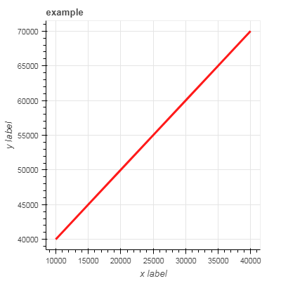
(3)x_axis_type, y_aixs_type: “mercator”
k = [1.0, 1.5, 2.0, 2.5, 3.0, 3.5, 4.0]
x = [i*10000 for i in k]
y = [i*10000+30000 for i in k]

p = figure(width=400, height = 400, title='example',
           x_axis_label='x label', x_axis_location='below',
           y_axis_label='y label', y_axis_location='left' )

p.line(x,y,color='red',line_width=3, alpha=0.9)

show(p)
没有设置 mercator的图示如下:
k = [1.0, 1.5, 2.0, 2.5, 3.0, 3.5, 4.0]
x = [i*10000 for i in k]
y = [i*10000+30000 for i in k]

p = figure(width=400, height = 400, title='mercator type example',
           x_axis_label='x label', x_axis_location='below',
           y_axis_label='y label', y_axis_location='left',
           x_axis_type='mercator', y_axis_type='mercator')

p.line(x,y,color='red',line_width=3, alpha=0.9)

show(p)
设置为 mercator 后的图示如下:
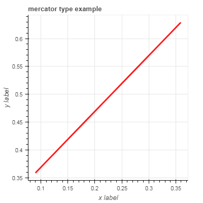
从上图的结果来看, mercator 好像代表的是 数值 10万,简写为 1。
当然,我不知道我的这个理解是否准确。
关于 mercator, 我暂时没有看懂是什么用途, 在网上查到了 mercator projection。
各位有兴趣的可以探索下。
麦卡托投影法 Mercator projection
最后,我们来小结下前面所述内容。
figure 的部分参数:
当然,还有一些参数没有提到,各位可以自行研究下。
对我的文章感兴趣的朋友,可以关注我的微信公众号「Python数据之道」(ID:PyDataLab),接收我的更新通知。